Blog

Web design and colour blindness: how to create a homepage, which can be used by everyone
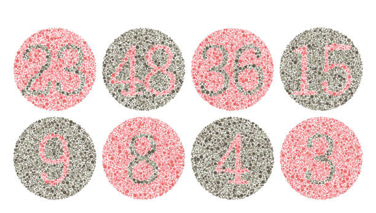
Colour blindness, frequently also called daltonism, is a vision pathology, inability to see and distinguish any specific colour, colours or their tones. This vision peculiarity is rarely found in females, whereas approximately every twelfth male is susceptible to it. Expressed as a percentage, some form of colour blindness is observed for approximately 8-10% of males and 0.5% of females. Generally compared — among 100 homepage visitors there may be approximately 10 visitors, who see colours differently.
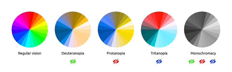
Briefly about colour blindness
People with colour blindness clearly see the same things as people without this vision peculiarity. The main difference is the inability to distinguish red, green or blue. Sometimes, also the ability to perceive yellow is lost. The rarest type of colour blindness is monochromatic colour blindness or complete inability to distinguish colours, i.e., a person is unable to distinguish any colour and sees the world in black and white tones. Whereas the most widespread type of colour blindness is the inability to perceive green and red, and tones that contain elements of these colours (for example, violet tones).
Why is it necessary to adapt the website design for colour-blind people?
Of course, many will ask, why changes to a homepage have to be made for meeting the needs of such a small group of people having this vision peculiarity. First of all, by making improvements to the website, the experience of all users, also those without colour blindness, will be definitely improved. In addition, by creating a homepage that is easy to use and accessible for everyone, the best practice of web design is followed. When developing or improving own website, it is advisable to observe some key rules to ensure that the design is friendly also to colour-blind users.
#1 Choose the minimalist style
A homepage created in the minimalist style does not mean just following the latest web design trends, but also is a useful tool that helps to distinguish colours. In recent years, also e-commerce involves as simple design as possible for the user to be able to better perceive the information. When customising your website, based on the minimalist principles, reduce diversity of excessively pronounced colours. The less colours are used in the website design, the better people with colour blindness will distinguish the user interface. In this situation both sides are winners – because also for people without colour blindness it will be easier to perceive your homepage.
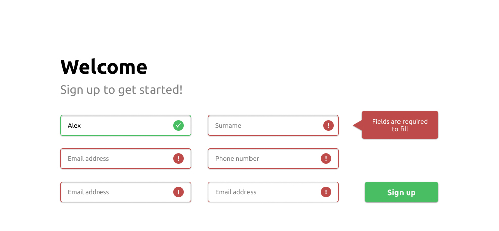
#2 Use graphic symbols
Of course, use of colours on websites is a common thing; however, it is not recommended to rely only on colours. For example, everybody knows a situation, when errors or various notifications are displayed in red on homepages. However, those people who have any form of colour blindness, which prevents them from distinguishing red, probably will not be able to identify this notification or error. In these cases it is advisable to supplement the error notifications with some graphic symbol or an appropriate text to draw the user’s attention.
This also refers to other colours used on the homepage. People with inability to distinguish between green and red, will be able to correctly identify approximately 5 crayon colours from 24 crayons in the box. Therefore, it is recommended to supplement the most important notifications/elements with some icon or other graphic symbol, picture or a respective description.
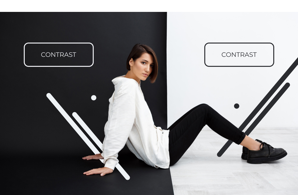
#3 Use contrasting colours and tones
The contrast between black and white is not the only option to improve the browsing experience of users with colour blindness. Use various clearly contrasting colours to highlight the essential text or menu options. Frequently, internal links or any other important items are highlighted in a different colour.
#4 Beware of some combinations of colours
Although the previous paragraph advised using of contrasting colours, not all combinations of colours are friendly to colour-blind people. To choose the right combinations, it is necessary to understand the substance of colours and spectre characteristics. Since colour blindness has many different manifestations, it is quite difficult to determine, which colours are “safe” for the website design. However, there are several combinations that are NOT recommended for using in web design, if you want to adjust your website in order to meet the needs of people with colour perception peculiarities. Such combinations are, for example:
• Green + red
• Green + blue
• Green + brown
• Green + grey
• Green + black
• Light green + yellow
• Blue + violet
• Blue + grey
If these combinations of colours will be used, for example, in CTA (call to action) buttons or menu, colour-blind people may have difficulties with noticing these items — the user can simply not notice the button “Buy now” and never click on it.

#5 Supplement website elements with texture and patterns
To highlight various elements of your website, it is recommended to use contrasting patterns or textures instead of single colour elements. For example, for users with colour blindness it is often difficult to perceive various graphs, such as column graphs, the so-called pie charts, etc. If graphs and charts have an important role on your website, it is advisable to use contrasting textures for displaying these items, so that the displayed results could be distinguished. This is particularly important in the cases, when wide diversity of colours is not used in the website design. However, it is also significant not to get too excited with textures, because it may seem distracting for many users.
In general, development of homepage design that is accessible for all users does not require much time, and the end product will be convenient both for colour-blind people, and people without this vision peculiarity. If you also wish to create a homepage that can be used by everyone, contact our developers and we will offer solutions that are most suitable for you.
Related Articles

You are mistaken if you think mobile apps are only for big brands. An increasing number of small and medium-sized businesses are following mobile trends and realizing that an effective mobile strategy goes beyond a mobile-friendly website and that their business needs a mobile app.

A conference website is an effective way to generate buzz about your event, answer frequently asked questions and increase ticket sales and attendance.
UX design is a serious science because it is based on consumer psychology and behaviour. Today, up to 94% of people distrust companies with poor user experiences and website design. Knowing the nuances of consumer behaviour can help you transform your business in a positive direction.