Blog
How to effectively introduce humour on your website
UX design is a serious science because it is based on consumer psychology and behaviour. Today, up to 94% of people distrust companies with poor user experiences and website design. Knowing the nuances of consumer behaviour can help you transform your business in a positive direction.
So how does humour relate to attracting potential customers and gaining their trust online?
If people like your content, they will stay longer on your website and ultimately send signals to search engines that they have found a particular website useful or enjoyable, thus improving your brand’s SEO position.
Witty content makes people want to know more about a company and its services, so humour can be a great tool to improve user experience! When combined with strategic minimal design, a brand can really stand out and grab more attention.
How can I incorporate humour into my website design to promote a positive user experience?
Get to know your businesses’ target audience
It seems pretty obvious, but if you want to give people the best experience on your website, you need to know who they are. Customers have different senses of humour. What one finds funny, another may perceive as bad taste. While you cannot please everyone, there are some guidelines you should keep in mind.
For example, you can use simple word games or generalisations to make sure everyone understands what the main idea is. Do not go into obscure topics unless your site is for a very narrow niche.
Know when to use humour in your page design
The humour is quite universal, so there is no need to worry that it might not be suitable for your site. It can even be integrated into political, e-commerce or educational platforms, as long as you keep it simple and know when it is appropriate to use humour.
In real life, you do not start joking at inappropriate moments. The same principles should apply to your website. You are not obliged to fill every corner of the page with funny images or text, but there are occasions when you can afford to be less serious and insert something funny.
Build the “About us” sections of your website creatively
Typically, the “About Us” page provides essential information about the company and its team. It is quite simple and aims to allow visitors to get to know the brand better. And what is a company if not its employees?
If you want to show your brand’s personality and make your team more engaging, a touch of humour is the way to do it. Whether you choose to share a funny anecdote about the company or encourage employees to take silly photos, do not forget that your “About Us” page should give potential customers an insight into what you stand for.
This approach will help to create the desired emotional connection with clients that is essential for sustainability. Research shows that if people perceive a company to be without personality, they will often look for a competitor instead.
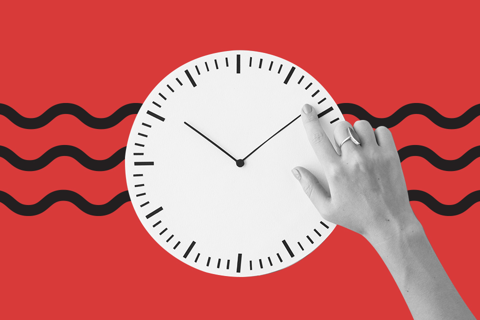
Use loading screens creatively
By adding engaging elements or a touch of humour to loading screens, companies can reduce the unpleasant feeling of waiting that users experience when waiting for something to load on a particular website. This tactic has been shown to reduce bounce rates and promote a positive online experience.
Where to find inspiration for the loading screen?
Oddly enough, video games are a great inspiration for the loading screen. By default, a lot of content needs to be prepared before a player can start their adventure, which is why most video games use multiple loading screens.
Witty “Contact us” pages
The “Contact Us” page is often overlooked by companies and is usually the most uninteresting page on almost every website. But this is so wrong!
When people go to the contact section, it means that they are ready to take an action that will promote the company’s business. They either need more information or they want to place an order, make contact or propose a partnership.
Without a good “Contact Us” section, a business can miss out on a lot. By adding humour to this section of your website, you will really engage your visitors and allow them to make purchasing decisions that are right for your business.
A funny email newsletter is effective
If you think email marketing is dead, you are very wrong. However, much of its success depends on clever content. From the subject line to the main body of the content, you can achieve much higher click-through rates by using only written content.
How can you personalise your brand?
Treat your brand as if it were a person – as if you were using it to communicate, network, make friends and help other people. We are all social beings and we aspire to this kind of brand presentation.
Humour is the best way to connect with customers and humanise your brand, so do not be afraid to laugh about harmless topics or your company. This is what will make your brand recognisable. Flaws do not always have to be hidden or lied about, people like to be understood and know that the people behind the brand are the same.
Communicating important messages through humour
Although conveying your company’s main message is difficult, one effective way to get people to read important information on your website is to grab their attention with something amusing.
Funny jokes and humorous games can help to alleviate user frustration when a process on the site does not work as intended.
How to create humorous content
That is certainly easier said than done. If you want to add some humour but do not know where to start, begin with the blog section of the website. It can be easier to incorporate a playful expression into content marketing.
When and where can you use humour on your website?
Depending on the type of company, humour can be used in small or large doses. It all depends on whether it fits your business model, website design and brand identity.
You can choose whether you want your website to be light-hearted, using a play on words now and then, or whether you want to create a comical, humorous look for your brand.
You can incorporate humour fully into the design or use smaller site elements such as animations, pop-ups, loading screens and sliders.
Every page on your website can have a humorous side, but one of the best and most natural places to start is the “About Us” page. It is always important to make sure that the overall tone is consistent throughout your website. This will ensure that the customer journey is smooth, not overwhelming or confusing.
The power of humour in the content is clear and unwavering. A great copywriter can help you create a humorous tone in your blog posts that will make your website visitors want to consume more of your content.
Make sure you check and find the right dose of humour for your website. This is a valuable website design and branding tool.
Humour can resonate with consumers and encourage them to make a lasting emotional and personal connection with your brand, which can easily translate into long-term loyalty and thus increase your company’s revenue.
Whether you want to fill your entire website with witty phrases or you want to discreetly inject a dose of fun into certain areas, there is no doubt that humour will leave a lasting impression on your audience.
Related Articles
You are mistaken if you think mobile apps are only for big brands. An increasing number of small and medium-sized businesses are following mobile trends and realizing that an effective mobile strategy goes beyond a mobile-friendly website and that their business needs a mobile app.

A conference website is an effective way to generate buzz about your event, answer frequently asked questions and increase ticket sales and attendance.

Becoming self-satisfied with your company website is a dangerous mindset. If you don’t continually improve your website and update it as trends change, you can scare away customers.