Blog
Fear of white spaces on the homepage! Horror Vacui (in Latin)
Horror Vacui translates from Latin as fear of empty spaces. Mario Praz, an Italian art and literature critic, came up with this name in the Victorian art and designated works of art that were overloaded with details. In the Victorian era it rather meant prosperity. This trend dominated also in the interior of wealthy people. Nowadays, this term can be found in interior design, printing design and also digital environment, but it does not always mean better.
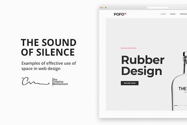
What is the white space on a homepage?
It is also known as the negative space, which can be in any colour. It is the empty space that separates the essential information.
What elements the white space is divided into?
- Micro white space.
The space between rows of a text. It allows to distinguish the text and makes it readable.
- Macro white space.
The space that separates essential elements from each other, for example, the right and left column, which separates the homepage content from edges of the computer screen.
Why the white space is important?
- It helps to read and perceive a text
- It emphasises the most significant information
- It gives sophistication to details
How to answer to the argument “There is too much white space!”?
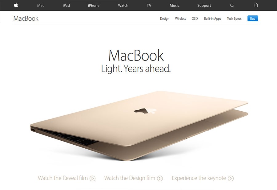
1. home page
Client: There is too much white space on the home page!
Answer: Clients visit your home page to find a specific information about the offered product or service. Too much useless information will only distract their attention. Also remember the Hick’s (William Edmund Hick) law – the more options are offered to a person, the more difficult it is to make a decision, and the person may choose nothing at the end!
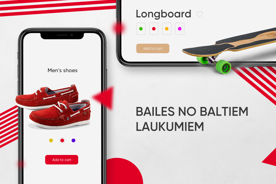
2. Product page
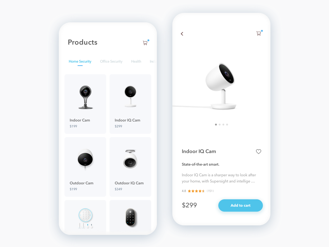
Client: There is too much white space on the product page!
Answer: The main purpose of this page is to sell a product. Clients tend to choose simple things, instead of complicated ones. They want to receive the needed information fast and easy – so, the aim is to display a product with easy perceivable images and information without unnecessary details.
3. Product description
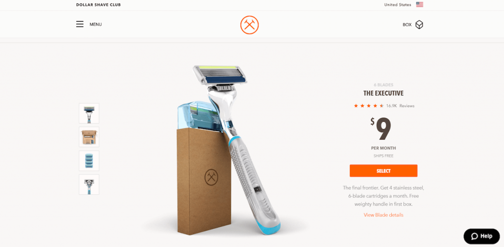
Client: There is too much white space on the product information page!
Answer:
perception of information!
4. Function page
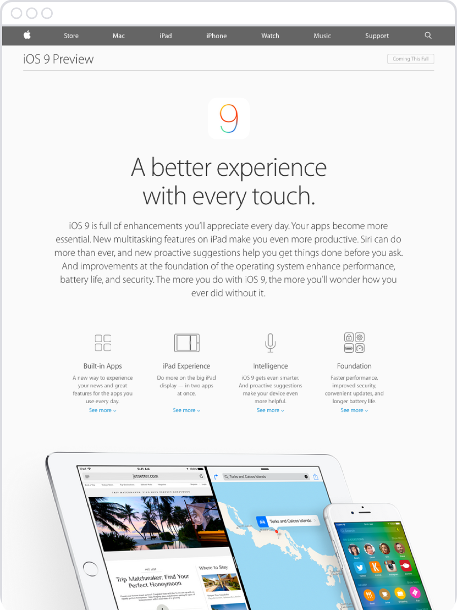
Client: There is too much white space on the function page!
Answer: The purpose of this page is to give information about the product functions. Balance needs to be found between the amount of information. When there are too many functions, they do not give the expected result. How to understand, what is the most essential information, what needs to be emphasised for the specific product and is not exhausting for the user!
5. Sign up form
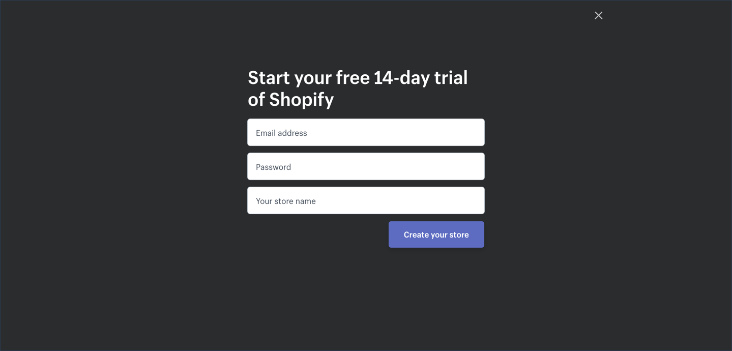
Client:
Answer: The aim is to achieve that the client signs up for a specific service or product. Before the client starts using a specific service or product, probably, he or she does not have to provide detailed information. The user should not be scared with extensive forms to be filled in!
Frequently, less is more! This refers also to web development – do not burden the user with art only you understand, and allow the user to make a decision fast and without redundant irritation! Do not try to kill all birds with one stone, constantly reminding to the user all the assortment of products offered on the page, what products are acquired at the particular moment by other users and intrusive chat boxes!
Can we help you with development of e-commerce or homepage?
Related Articles

You are mistaken if you think mobile apps are only for big brands. An increasing number of small and medium-sized businesses are following mobile trends and realizing that an effective mobile strategy goes beyond a mobile-friendly website and that their business needs a mobile app.

A conference website is an effective way to generate buzz about your event, answer frequently asked questions and increase ticket sales and attendance.
UX design is a serious science because it is based on consumer psychology and behaviour. Today, up to 94% of people distrust companies with poor user experiences and website design. Knowing the nuances of consumer behaviour can help you transform your business in a positive direction.