Blog

Mobile app design guidelines
Setting up a website is not easy. Many websites have good content but a bad design. Or, if they are well designed, they are poorly maintained. Web development is not about coding alone – design plays an important role in the process as well.
Your website is the face of your business. People will explore your website when looking for information, so it needs to be unique and flawless. Website visitors should be able to find what they are looking for with a minimum number of operations.
Consumers around the world love to spend time on their mobile devices. Using an application and developing an application are completely different things. If the app is well designed, you won’t notice the design because you’ll be too busy enjoying the app itself. But if the app design is lacking, this is probably the first thing the user will notice.
Present a limited set of features
Nothing is more confusing for first-time users than a website with too many features. The most successful websites on the market are very focused on offering a limited set of features. Limit the feature set of your website by prioritising the most important ones.
Focus on improving your user experience! Analyse which features of your app are used most often and make an effort to make the experience intuitive.
Navigation and user workflows
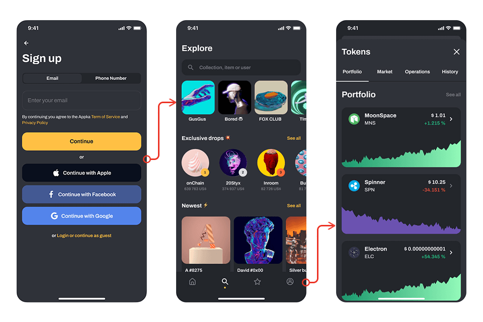
Make navigation self-evident! Be sure to use a navigation style familiar to users and keep navigation simple. Create a clear screen flow hierarchy by assigning different priority levels to key user options and tasks.
Don’t give users too many choices. Keep navigation simple and minimal, and make the relationships between choices obvious so users know what to do next. Do not design an app that works unintuitively. You need to give users a strong sense of control over your app.
Finger-friendly tap-targets
You will need to work closely with developers to ensure your app integrates well with readers. Make sure your buttons can be easily tapped with fingers and thumbs. A good minimum size for a touch target is 7-10 mm. It is absolutely important to leave enough space between buttons and navigation elements so that users are not bothered by an unpleasant experience.

Minimal writing required
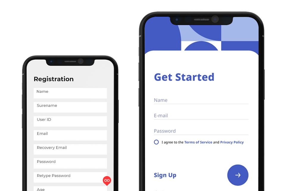
Writing on a mobile device can be a slow process that is prone to many mistakes. Ask users only what you really need to know. Keep forms as short and simple as possible by removing all unnecessary fields.
Make data entry as efficient as possible. If possible, offer choices instead of input fields, as it is easier to choose from a list of predefined options than to type in an answer manually.
A homogeneous experience
It is wrong to think of mobile apps as separate experiences. A typical user has multiple devices, such as a computer, a mobile phone and a tablet, and when they use your website, they expect to have an equally good experience on all of them.
Introducing the app to users
First impressions are everything!
If the app asks for permissions right from the start, users often reject these permission requests because there is no context for the user to make a decision at that point.
Let users explore your app before gently asking them for permission or to register on the website. Users do not like to be asked to create an account before they start using the app. To ask a user to share their data with you, you need to make your app worth it.
Users are more likely to grant permissions or register if they are requested during a specific task. Only request permissions at runtime if absolutely necessary for the core app experience.
Dark screen when loading content
A blank screen during content loading can give the impression that your website is frozen, which can cause confusion and frustration. You should always try to give the impression that your website is fast and responsive. Use temporary containers to give the impression of fast loading.

Interaction with the app
Use standard gestures for shortcuts. People are familiar with standard gestures, so they are happy if they don’t have to make extra effort to discover or remember new ones. Unless your app is a game, people rarely appreciate having to learn new ways of doing basic things.
Web experience in apps
Visitors expect certain interaction patterns and interface elements in mobile apps. Avoid the use of underlined links, as these are a natural part of the browser page model, but cannot be applied to the mobile experience as they use buttons rather than links.
Dead-end pages
You should avoid creating dead-end pages on your websites, as they act as flow blockers – they create confusion and unnecessary extra steps for your users.
Mobile web
Users can easily get frustrated if an app redirects them to the mobile web to get more content or complete a task. This reduces conversion as users may simply not return to the app.
If your mobile app is missing a particular feature or piece of content, use an in-app browser.
Don’t ask users to rate your app during their first experience
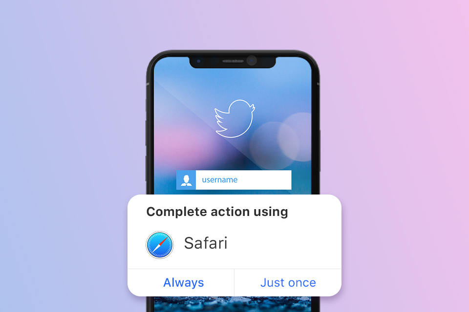
It is not wrong to ask for feedback, but it is very important to give users a great experience first. To encourage honest feedback, give people time to form an opinion about your app before asking them to rate it.
Most app developers understand that ratings and feedback are important. In their efforts to collect valuable feedback, many app developers often make the mistake of forcing users to rate their app immediately. Asking for ratings too quickly or too often is annoying for visitors and reduces the number of reviews received. Look for logical pauses to ask for an assessment when it makes the most sense.
The key is to always put the user first, to take the time and effort to build a solid plan using the knowledge gained in the discovery phase, and to continuously ask for feedback on the design and feel of the app.
Creating intuitive experiences is hard, but in the end it is worth it if users get a valuable experience and enjoyment.
Related Articles

You are mistaken if you think mobile apps are only for big brands. An increasing number of small and medium-sized businesses are following mobile trends and realizing that an effective mobile strategy goes beyond a mobile-friendly website and that their business needs a mobile app.

A conference website is an effective way to generate buzz about your event, answer frequently asked questions and increase ticket sales and attendance.

UX design is a serious science because it is based on consumer psychology and behaviour. Today, up to 94% of people distrust companies with poor user experiences and website design. Knowing the nuances of consumer behaviour can help you transform your business in a positive direction.
